A Visual Identity That Reflects Innovation & Connectivity
We are proud to present IntegratD, our cutting-edge integration and monitoring system designed to deliver unparalleled efficiency and innovation to your operations. IntegratD serves as the foundation for a diverse suite of products, each meticulously crafted to address the unique challenges of modern businesses.
In today’s fast-paced digital landscape, a brand’s visual identity is more than just aesthetics—it’s a reflection of its purpose, values, and the experience it offers to customers.
At MQAttach, our vision for IntegratD was clear: a seamless, dynamic, and intelligent integration platform designed to unlock business insights. This philosophy is deeply embedded in the design of the IntegratD logo.

A Seamless Flow of Connectivity
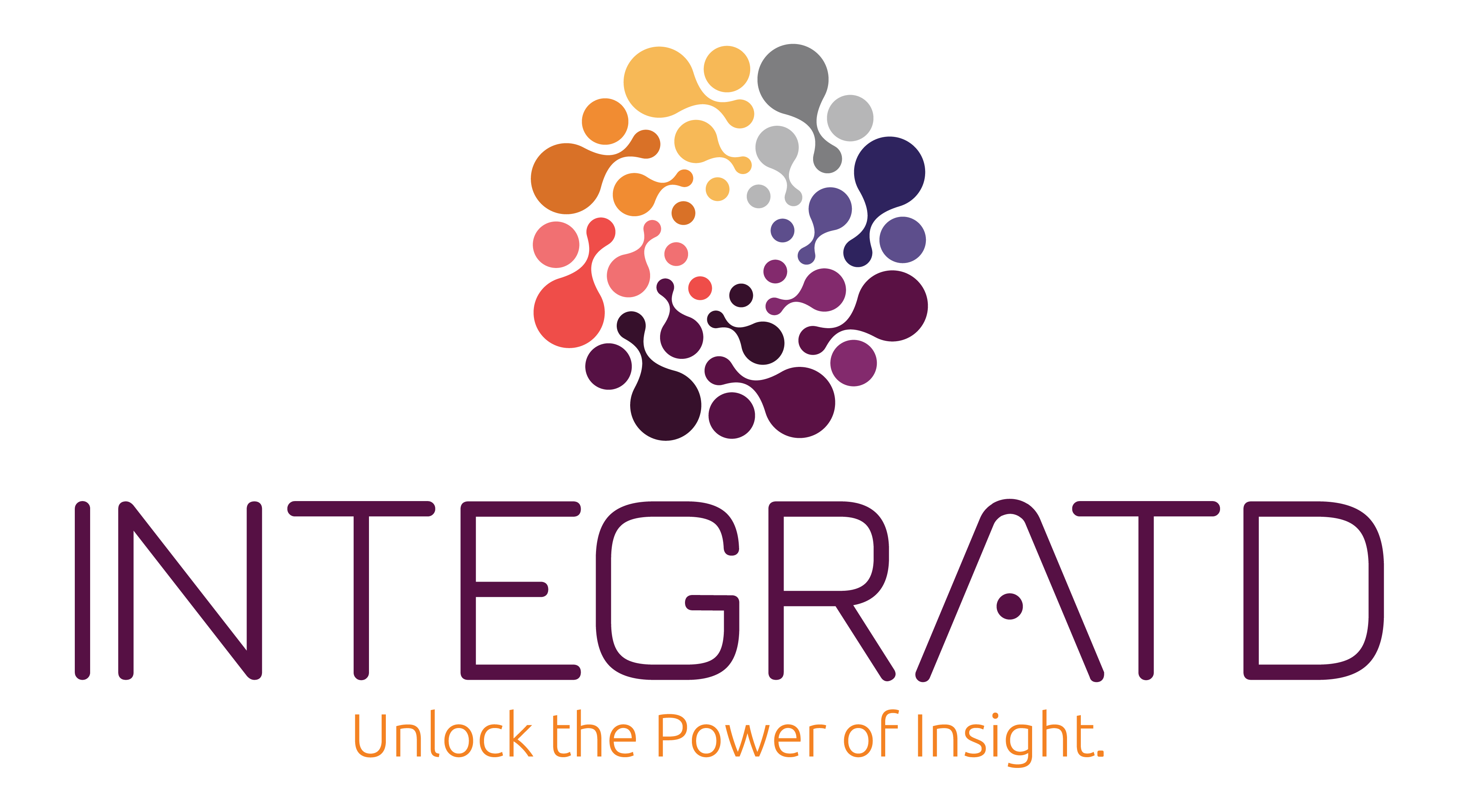
The IntegratD logo isn’t just a visual mark—it tells a story. The swirling pattern of interconnected dots forming a circular motion represents the fluid exchange of data, seamless connectivity, and digital transformation. Each dot is a metaphor for the various systems, applications, and processes that IntegratD brings together under a single unified platform.
The color gradient flowing from warm hues (orange, red) to cooler tones (purple, blue, grey) represents transformation and evolution—precisely what IntegratD facilitates for businesses across industries. This spectrum embodies agility, adaptability, and the seamless integration of different technologies into one cohesive ecosystem.
A Modern Touch on Integration
The bold yet sleek sans-serif typography of INTEGRATD reflects modernity, efficiency, and professionalism. Notably, the stylized letter “A” with a small circular node emphasizes the concept of integration and connectivity—a subtle yet powerful visual cue that ties into our core value proposition.
The absence of the second ‘E’ in “INTEGRATD” isn’t just a design choice—it’s a statement. It makes the brand name visually distinctive, symbolizing speed, efficiency, and a streamlined approach to integration.
Unlock the Power of Insight
Accompanying the logo, the tagline “Unlock the Power of Insight” encapsulates what IntegratD stands for. The warm orange hue in the tagline creates a contrast that draws attention, reinforcing the idea of intelligence, innovation, and proactive decision-making. It aligns perfectly with the product’s mission—to empower businesses with real-time visibility, actionable insights, and seamless data orchestration.
A Logo that Speaks to Our Mission
The IntegratD logo embodies everything our platform represents—scalability, security, intelligence, and seamless integration. Whether you’re in banking, retail, manufacturing, healthcare, or insurance, IntegratD ensures that your data flows effortlessly, enabling business agility and digital transformation.
At MQAttach, we believe that a brand’s visual identity should resonate with its audience and communicate its purpose at first glance. With IntegratD, we’ve created not just a product, but a movement towards smarter, more efficient integration.
A special thank you to our external graphic designer at Freelancer SA for bringing our vision to life.


